
London · Web project for clinics, practices and the people who build for them
“A clinic website is judged in the first ten seconds. Real rooms, real surgeons and a page that loads before the patient gives up.”
Kensington Cosmetic Clinic is a private cosmetic and plastic surgery clinic on Marloes Road in Kensington, led by the surgeon Dr Hassan Soueid. SwainUK designed and built its website and the management system behind it, and Joshua Swain shot the clinic photography and the team films that run through the site. This case study walks through what a private clinic actually needs online, how the pages, the media and the back office were put together, and the lessons that apply to any clinic or practice planning a new site.
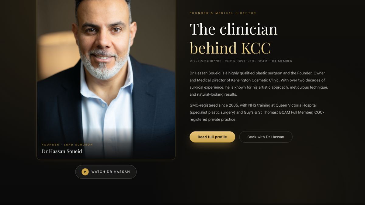
The surgeon first: Dr Hassan Soueid on the homepage
01 · The brief
What a private clinic needs from its website
Patients choosing a cosmetic surgeon are cautious, and they should be. Before they pick up the phone they want to know who will operate, where, and whether the clinic looks like a medical practice or a beauty salon. The site had three jobs: show the surgeon and his team as real people, show the building and its operating theatres honestly, and give patients and staff a clear route from first question to booked consultation.
The clinic had originally lived as a section of another SwainUK project. It was split out onto its own domain, its own hosting project and its own code repository, which made it easier to give the clinic its own design, its own email set-up and its own search presence.
| Need | What was built |
|---|---|
| Trust in the surgeon | A dedicated Dr Hassan page with background, training and two click-to-play films |
| Trust in the building | A facility page and a homepage gallery built from real photographs of the clinic |
| Clear treatments | A five-part menu (Face, Breasts, Body, Non-Surgical, About) leading to individual treatment pages |
| A way in | Consultation booking, patient accounts and a voice assistant in the header |
| A back office | Admin and doctor views connected to the clinic's practice software |
02 · Photography
Real rooms, shot for the web

The facility page: the main operating theatre, then the minor-procedure rooms, each with its own photograph.
The clinic's strongest argument is the building itself: a Kensington town house with two operating theatres, separate recovery rooms, consultation rooms and a beauty room. Joshua photographed the interior and edited a library of around two hundred images. That library is what the site is built on, and it is why the pages can describe each room and then show it.
Two rules made the photography work on screen. First, no repeats. An early version used the same grey-chair room for recovery, consultation and beauty, and patients notice that kind of thing. Every room on the facility page now has its own picture. Second, every image has a landscape crop for desktop and a portrait crop for phones, served with the HTML picture element, so the theatre lights or the reception desk stay in frame on a small screen instead of being cut in half.

The homepage gallery in four tabs: Reception, Treatment rooms, Surgical and Outside.
On the homepage the photographs sit in a gallery with four tabs. The surgical tab names the equipment you can see in the pictures, such as the KLS Martin surgical lights and the Dräger anaesthesia machines, because a patient comparing clinics responds to specifics more than to adjectives. The gallery moves on by itself, zooms slowly into each image and pauses when a visitor hovers over it. If you are planning a shoot like this, the same thinking from running photo and video on the same shoot applies: list every room and every angle the site will need before the day, not after.
03 · Film
Team films that load only when asked


On a phone: the homepage film behind the title, and the Dr Hassan page with its two video cards.
Video does more for a clinic than any paragraph. Patients hear the surgeon speak, see the rooms in motion and meet the people who will greet them. Joshua filmed Dr Hassan, the clinic interior and the team for the site, and the films appear on the homepage, the Dr Hassan page, the facility page and the treatment pages.
An early lesson was about speed: a full-size hero video that downloads on every visit makes a site slow and costly to run. The fix became a house rule for the project:
Background loops are silent and small
The homepage hero went from a 90 MB master to a muted loop of about 4.4 MB, with a separate portrait version for phones.
Sound is click-to-play
The full interview with Dr Hassan, with audio, only downloads when someone presses Watch. Patient stories work the same way.
Compress the tour hard
The clinic tour on the facility page came from a 3.2 GB 4K file and plays at around 8 MB.
Keep images light
Gallery photographs average roughly 150 KB each, so the page stays quick on a phone signal.
One more detail worth copying: a video that plays muted inline should open, on click, into a full-screen player with sound, built so it covers the real screen rather than staying trapped inside its card. Clinics, like beauty brands, get the most from film when it is shot with the website in mind; the beauty videographer guide covers how to brief that kind of shoot.
04 · Design
Three directions, one shared page

Dark backgrounds and gold accents, with the photographs kept completely natural.
Clinic owners often find it hard to choose a look from a mood board. So instead of mock-ups, three complete colour versions of the homepage were built and put online as hidden preview pages: a near-black and gold version, a warm brown version and a deep navy version. All three used the same content and the same motion, so the clinic compared real pages on real phones. The dark and gold version went live.
The way they were built matters for anyone doing the same. Each version is a thin theme layer over one shared page, and it only changes colours on text, backgrounds and borders. An early experiment that shifted colours across the whole page also shifted the surgeon's skin tone, which is never acceptable on a medical site. Photographs and video are always left untouched.
The motion follows the same restraint: soft gold highlights, slow reveals as you scroll, nothing that blocks reading. Effects that follow the cursor are desktop only, and everything respects the phone setting for reduced motion. Where a page started to feel overdesigned, glowing effects were swapped for plain lists and hairlines: on a medical site, simpler pages read as more trustworthy.
05 · The system
The management system behind the website
The website is the front of a larger system. It runs on Next.js with Firebase for hosting, the database, sign-in and server functions. Behind the public pages there is:
Consultation booking. A step-by-step booking flow. A "Book with" button on a clinician's page opens it with that clinician already chosen. Confirmation emails go out from a dedicated mail subdomain with SPF, DKIM and DMARC set up, so they reach the inbox.
Patient accounts. Patients can register, sign in and see their own bookings, matched by email so a booking made as a guest appears once they create an account.
A link to the practice software. The clinic runs its diary in Pabau, and the system syncs with it, checking each clinician's real appointments before it accepts a booking. Reception is emailed about every booking, whichever channel it came from.
Doctor and admin views. Enquiries from the hair restoration page are routed to the right doctor's queue and to a daily digest.
Naomi, the voice assistant. A microphone in the header opens an AI voice concierge that answers questions about the clinic in five languages (English, Arabic, French, Spanish and Russian), checks availability and books consultations. It never quotes prices, never gives medical advice and never takes card details. A voice questionnaire collects pre-consultation answers as draft notes that a doctor reviews before anything is saved.
Two engineering lessons from this part are worth passing on. The voice assistant at first failed with a vague connection error; the cause was the site's own security policy, which had not been told to allow the voice service. Only a real browser enforces that policy, so voice features must be tested in a browser, not just from the command line. And when an outside system is your source of truth, check what its API really returns: an availability bug came from trusting a date filter that the diary API quietly ignored.
06 · Search
Speed and SEO work
The site is a static export, so pages are plain files served fast from the edge. On top of that:
Clean indexing
A sitemap and robots file from day one, and preview and utility pages marked noindex so they never compete with real pages.
Fix the boring things
A redirect setting was breaking the Search Console verification file. Turning off one option fixed it.
Long-form treatment guides
The clinic blog carries full articles of around two thousand words, each with sections, FAQs and internal links, rather than thin posts.
Say who built it
A /built-by page with structured data names the studio and links back, a small detail that helps both the clinic and the developer.
07 · Lessons
What other clinics can take from this
1. Shoot your own building. Stock interiors and generic smiling faces do not survive a patient's second look. A day photographing the real rooms and the real team pays for itself.
2. Before and after photos need a fixed position. A slider that wipes between two photos only works if both were taken from the same angle and distance. Decide the camera position before the first patient, not after.
3. Budget for bandwidth. Autoplaying full-size video is the most expensive mistake a clinic site can make. Silent loops, click-to-play sound.
4. Let the clinic choose from real pages. Hidden preview versions beat mock-ups for getting a clear decision.
5. Connect the website to the diary. A booking form that does not know the real calendar creates double bookings and phone calls.
Most of these points apply beyond medicine. If your business sells on trust, the case for real people over generated imagery is set out in real people vs AI in advertising.
More guides
Keep reading
FAQ
Common questions
What should a cosmetic clinic website include?
A page for each surgeon with training and registration, real photographs of the rooms and theatres, clear treatment pages, a simple way to book a consultation, and answers to the questions patients ask most, such as referrals, recovery and location.
Should a clinic use video on its website?
Yes, but carefully. Short muted loops can play in the background, while interviews and patient stories should only load when the visitor presses play. That keeps pages fast and hosting costs under control.
Can a clinic website connect to Pabau?
It can. On this project the system syncs with the clinic's Pabau account and checks clinicians' real appointments before accepting a booking, and reception is emailed about every booking.
How long does it take to build a clinic website and booking system?
A first version of this site went live within days of starting, then grew in phases: treatments, team films, the facility page, the voice assistant and the practice software link. Planning in phases lets the clinic launch early and add features as they are proven.
Written by Joshua Swain, who builds websites and booking systems and films for brands in London and Dubai. See the live site at kcclinic.co.uk.