Cinematic Color Grading for Luxury Brand Videos: A Master Cinematographer's Guide
Discover professional color grading techniques that elevate luxury brand videos. From fashion campaigns to commercial content, learn how cinematic grading creates premium visual storytelling.
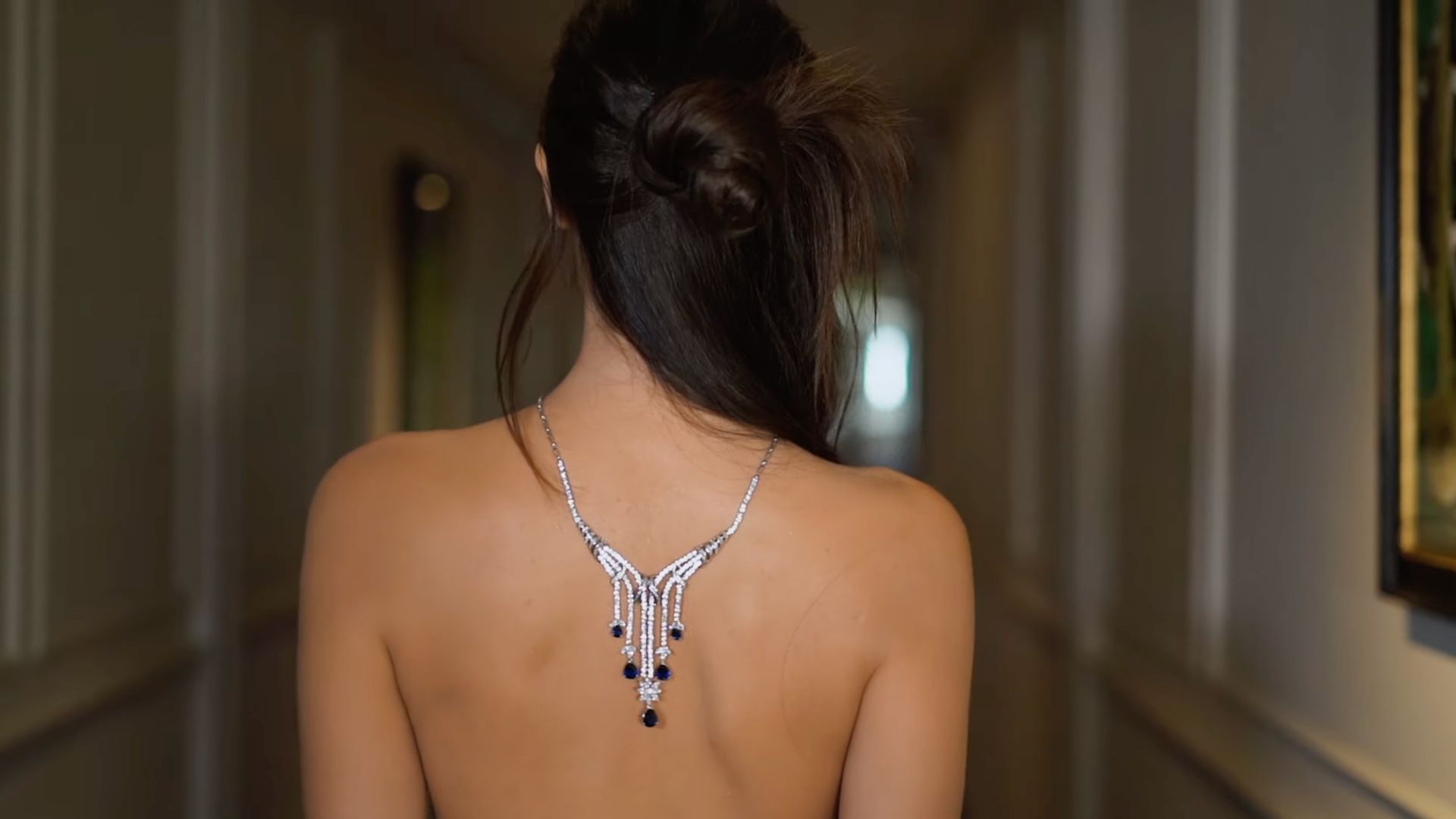
Cinematic Color Grading for Luxury Brand Videos: A Master Cinematographer's Guide
After twelve years behind the camera as a London videographer specializing in luxury brands, I've learned that exceptional cinematography is only half the equation. The other half, and often the most transformative, happens in post-production through cinematic color grading for luxury brand videos.
Color grading is where good footage becomes extraordinary. It's the difference between a well-shot commercial and a piece of visual art that stops viewers in their tracks. Today, I'm sharing the professional techniques and insights that have helped me create compelling content for luxury brands across London and internationally.
Understanding the Psychology of Color in Luxury Brand Storytelling
When I work with luxury brands, whether it's a high-end fashion campaign or a premium product launch, the color palette isn't just aesthetic, it's psychological. Every hue, saturation level, and tonal shift communicates brand values and emotional resonance.
Luxury brands operate in a realm where perception is reality. A commercial cinematographer must understand that warm, golden tones suggest heritage and craftsmanship, while cool, crisp blues convey innovation and precision. The subtlety lies in how these colors interact within the frame and across the entire sequence.
During my work on the Celine Commercial Dubai project, the color grading needed to reflect both the luxury of the brand and the sophisticated desert landscape. The challenge was maintaining brand consistency while allowing the location's natural palette to enhance, not overwhelm, the narrative.
Brand Color Psychology Fundamentals
Different luxury sectors require distinct color approaches:
- Fashion videography: Often demands high contrast with selective desaturation to emphasize texture and form
- Jewelry and watches: Requires precise highlight control and metallic tone enhancement
- Automotive: Benefits from dramatic shadows and enhanced reflections
- Beauty and cosmetics: Needs flattering skin tones and vibrant product representation
Essential Color Grading Workflows for Professional Video Production
My color grading workflow has evolved significantly over the years, but the foundation remains consistent: capture maximum information during filming, then sculpt the narrative through precise post-production work.
Pre-Production Color Planning
Before any camera rolls, I work closely with brands to establish a color bible. This document outlines the intended mood, reference materials, and technical specifications that will guide both the shoot and post-production phases.
As detailed in my Behind the Scenes Fashion Shoots: A London Videographer's Professional Guide, preparation is crucial. The color grading begins conceptually before we even arrive on set.
Technical Foundation: Log Profiles and RAW Workflow
For luxury brand work, I exclusively shoot in log profiles or RAW formats when possible. This approach provides maximum flexibility in post-production, allowing me to craft the exact aesthetic the brand requires without compromising image quality.
The additional data captured in log formats is essential when working with luxury brand content where every detail matters. According to PremiumBeat, professional colorists rely on this expanded dynamic range to achieve cinema-quality results.
Advanced Color Grading Techniques for Luxury Aesthetics
The techniques that separate amateur color work from professional-grade grading often involve subtlety and restraint. Luxury brands don't need flashy, over-processed looks, they need sophistication and refinement.
Skin Tone Perfection
When working with talent, whether for fashion campaigns or executive portraits, skin tone accuracy is non-negotiable. I use vectorscopes and dedicated skin tone indicators to ensure consistency across all shots, regardless of lighting conditions during filming.
The project with Vincent Nevs exemplified this approach, maintaining natural, flattering skin tones while enhancing the overall cinematic quality of the piece.
Selective Color Enhancement
One of my signature techniques involves selective color grading using luminance and saturation masks. This allows me to enhance specific elements within the frame, perhaps the rich leather of a luxury handbag or the brilliant facets of a diamond, without affecting the overall image balance.
This technique is particularly effective in fashion videography where product details need to be showcased while maintaining the artistic integrity of the shot composition.
Creating Depth Through Color Separation
Luxury brand videos benefit enormously from sophisticated depth cues created through color temperature and saturation variations. I typically warm foreground subjects slightly while cooling backgrounds, creating natural separation that guides viewer attention without obvious manipulation.
This approach, detailed extensively in resources from No Film School, helps create that premium, cinematic feel that luxury brands require.
Tools and Technology for Professional Color Grading
The tools are only as good as the artist using them, but having access to professional-grade color grading software and hardware is essential for luxury brand work.
Software Solutions
I primarily work with DaVinci Resolve for color grading, though I also utilize Adobe Premiere Pro's Lumetri tools for certain projects. DaVinci Resolve's node-based workflow provides the precision and flexibility that professional video production demands.
For complex projects requiring extensive secondary color work, the ability to create multiple correction layers without image degradation is crucial. This is where professional tools distinguish themselves from consumer alternatives.
Hardware Considerations
Color-accurate monitoring is absolutely essential. I use calibrated reference monitors that display the full color gamut and maintain consistency across different viewing environments. This ensures that what I see during grading matches what clients and audiences will see on various devices.
According to StudioBinder, proper monitoring setup can make the difference between amateur and professional color work, particularly when working with luxury brands that have exacting standards.
Brand Consistency Across Multiple Deliverables
Luxury brands often require multiple versions of content, social media adaptations, broadcast versions, web content, and international variations. Maintaining color consistency across these different formats and platforms requires systematic approach and careful documentation.
Creating Look-Up Tables (LUTs)
For each luxury brand project, I develop custom LUTs that encapsulate the approved color aesthetic. These serve as starting points for future content, ensuring brand consistency while allowing for creative variations based on specific project requirements.
Platform Optimization
Different platforms have varying color reproduction capabilities. Instagram's compression affects color differently than YouTube's, and broadcast television has its own considerations. A professional commercial cinematographer must account for these variations during the grading process.
Common Pitfalls and How to Avoid Them
Over the years, I've observed several recurring mistakes in luxury brand color grading that can undermine otherwise excellent work.
Over-Saturation Trap
The temptation to push saturation too far is common, especially when working with vibrant fashion pieces or colorful products. Luxury aesthetics typically favor subtle enhancement over obvious manipulation. The goal is to make everything look naturally perfect, not artificially enhanced.
Ignoring Skin Tone Variations
When working with diverse talent, it's crucial to grade skin tones individually rather than applying blanket corrections. This attention to detail separates professional work from amateur attempts.
Inconsistent Lighting Continuity
Color grading can fix many issues, but it cannot completely compensate for poor lighting continuity during filming. The best results come from combining excellent cinematography with skilled post-production work.
The Future of Color Grading in Luxury Brand Content
As technology evolves, so do the possibilities for cinematic color grading for luxury brand videos. HDR workflows, expanded color gamuts, and AI-assisted tools are changing how we approach color work.
However, the fundamental principles remain unchanged: understanding brand identity, maintaining technical excellence, and serving the story above all else. These principles have guided my work as a London videographer for over a decade, and they'll continue to be relevant regardless of technological advances.
Frequently Asked Questions
How long does professional color grading typically take for a luxury brand video?
The timeline varies significantly based on project complexity, but I typically allocate 1-2 hours of color grading time per minute of finished content for luxury brand work. Complex projects with multiple products, varied lighting conditions, or extensive secondary color work may require additional time. The key is allowing sufficient time for refinement and client feedback iterations without rushing the creative process.
What's the difference between color correction and color grading for luxury brands?
Color correction addresses technical issues, fixing exposure problems, balancing white balance inconsistencies, and ensuring consistent skin tones across shots. Color grading is the creative process that follows, where we craft the aesthetic mood, enhance brand colors, and create the cinematic look that aligns with the brand's visual identity. Luxury brands require both technical perfection and artistic sophistication.
How do you maintain color consistency across different delivery formats?
I use a systematic approach involving custom LUTs, reference scopes, and calibrated monitoring across multiple display types. Each project begins with establishing a master grade on calibrated reference monitors, then creating optimized versions for specific platforms while maintaining the core aesthetic. I also provide clients with viewing guidelines and technical specifications to ensure consistent reproduction across their various distribution channels.
Ready to elevate your luxury brand's visual content with professional cinematic color grading? With over twelve years of experience creating compelling content for premium brands, I bring the technical expertise and artistic vision necessary to make your brand stand out. Contact SwainUK today to discuss how professional color grading can transform your next video project into a powerful piece of brand storytelling.